
Are you dreading another year of chasing down all the applications in your inbox? For organizations that solicit and process applications, now is the perfect time to take stock of what’s working well and what could be improved. Here are a few questions that may be worth asking your team as we all close outRead More
Blog
SlideRoom saves the Gibbes Museum of Art 12 hours per application cycle!

So many museums, zoos, and aquariums use SlideRoom and see significant improvements in their workflows, and application numbers. One such museum we recently spoke with, is the Gibbes Museum of Art in Charleston, South Carolina. With SlideRoom, the Gibbes Museum of Art found: A ubiquitous and professional platform that other museums, galleries, competitions, and nonprofitsRead More
Meet SlideRoom Superstar the Museum of The African Diaspora

One of my favorite things about working for SlideRoom is learning about all the really interesting organizations that use SlideRoom. I am a self-proclaimed “museum nerd.” I absolutely love museums. It was my goal once to work in museums, helping lead visitors to find new and interesting ideas through the objects our cultures produce. Now,Read More
Simplify your application process with SlideRoom

When your institution needs to hire a new cohort of interns, what happens? You draft emails, publish the listings, and then wait. Soon, your inbox is flooded with issues, questions, complaints, meeting requests, and stakeholders feeling frustrated. Weeks or months go by and finally, you hire a few interns. Sound familiar? Wouldn’t it be wonderfulRead More
Celebrating 15 Years of SlideRoom with Founder Chris Jagers
As SlideRoom celebrates its fifteenth anniversary, we caught up with its founder, Christopher Jagers, to get his reflections on SlideRoom’s prescient beginnings and its intriguing evolution. Successful products are borne of true need plus the ability to fully recognize that need. When Chris Jagers first conceived of SlideRoom, he was driven by an uber-keen understandingRead More
Exploring Maker Portfolios

For engineering programs, the ongoing challenges of identifying best-fit candidates and filling seats has been made even tougher than ever this year. Pandemic-driven declines in international enrollment and necessary concessions toward a test-optional environment have meant that admissions and enrollment teams have fewer options and fewer insights to work with. Plenty of experts talk about the value of holistic review in this setting. When we are struggling to collect “more/better,” the notion ofRead More
When the Show Must Go On: How a Prestigious Dallas Arts High School Saved its College Showcase during COVID-19 and Put Students and Recruiters Center Stage
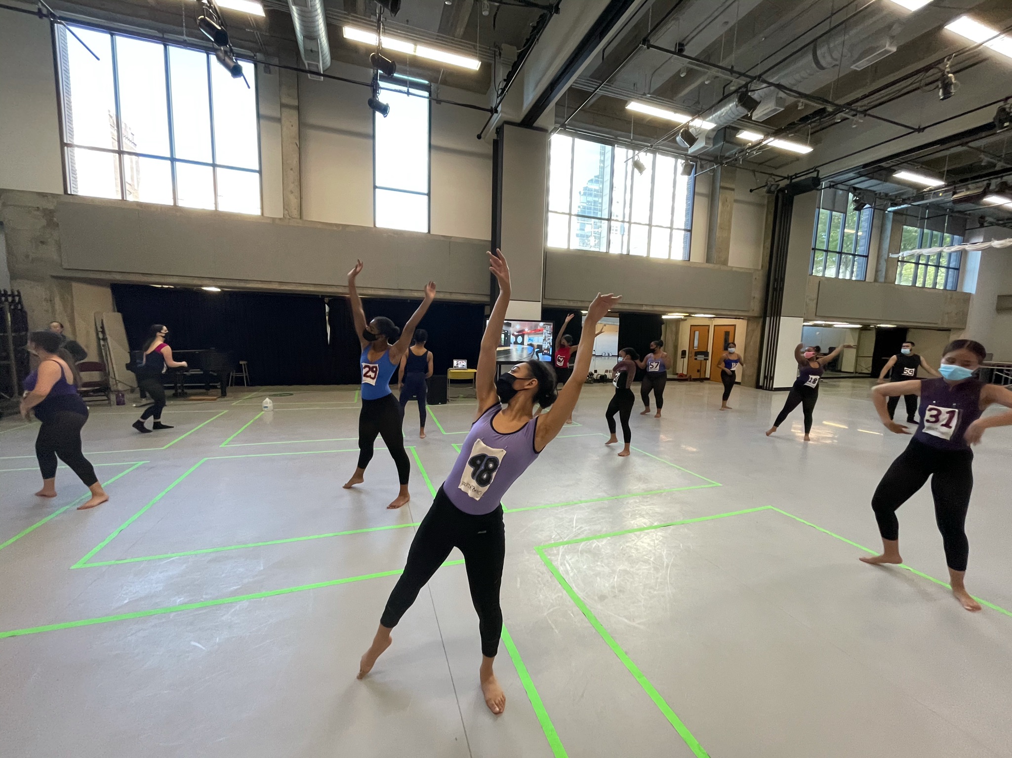
The Booker T Washington High School for the Performing and Visual Arts in Dallas, Texas has a reputation that precedes itself in several notable ways. Founded in 1922, this award-winning Arts Magnet and member of the Dallas Independent School District was Dallas’ first high school for African American students. Renamed for Black community leader andRead More
Reimagining College Access with SlideRoom™ Portfolios

It’s almost impossible to achieve equitable college admissions outcomes and the subsequent success of students without first understanding what motivates passionate, highly qualified applicants. That’s one reason more colleges and universities are using application portfolios as they adopt holistic admissions policies and look beyond traditional metrics such as test scores, essays and letters of recommendation.Read More
Why Application Portfolios Are Here to Stay

Are application portfolios a niche tool for art schools, or will they become an integral component in the future of college admissions? At the 2020 Common Application Virtual Summit, undergraduate admissions officers discussed why more programs should incorporate portfolios, and shared best practices for how to do so effectively. Becky Chassin, Assistant Dean Undergraduate AdmissionRead More
6 Ways for Your Admissions Office to Maintain Operational Continuity with SlideRoom™

During these unprecedented times, maintaining operational continuity is one of the biggest challenges and top priorities for businesses and organizations of all types. For your higher education institution, that can mean anything from continuing to deliver quality instruction to maintaining your application review processes without having access to your physical admissions office. Read on forRead More